Monday, 20 February 2012

Poster Research


Okay so for Pro Three Task Three I'm thinking I'm going to try out more hand made stuff using stamps and cut outs etc rather than all computer based work, like we were shown in class on Wednesday. I think I'd be more suited to that because I'd rather get my hands dirty. The first two images here have a nice rustic feel to them, not square edges and slightly dirty backgrounds. Although I do still like the clean look which is shown in this last poster, I also like how the type has been dragged out to the edge of the pages it draws your eye into the writing.

Sunday, 19 February 2012

Photo type

The actual cutting in this piece is really messy but i like the idea of using photos. The image is distorted in a way that you cant make out what it should be so you focus more on the colour in it. It gives it a bit of texture aswell.

Saturday, 18 February 2012

Lots of nice things...


Not really looking at the type here but more how its created. Plus its a nice image as a whole. To me, hand written type suggests that someone has stopped and taken the time and cared about what they were doing, it gives it a bit of a romatic theme two. I like joined writing but sometimes it can be difficult to read.


The simplicity in this is nice. Each letter is the same size, and each indent is the same size.


Not so much the type that i like in this but the way its been used to create a picture.


The two pieces above are more 3D which is interesting because i wouldn't have thought of doing anything in 3D. Especially like the top one with the design that has been put around the 3D 'T'


I love this piece, its just really clever. It uses images related to the word to create the type. I like the effect on the background page, just a little bit dirty to make it feel real.

Friday, 17 February 2012

Panic at the Disco


Here im just looking at 'Panic Disco'
I like the way the same shape has been used to decorate each of the letters. It gives it a uniform look, even though the shape has been made smaller or shorter for some of the letters.

Thursday, 16 February 2012

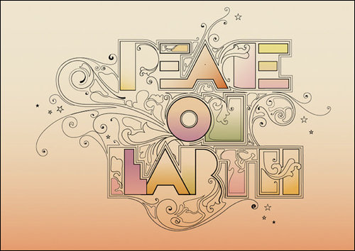
Peace


The outline around the lettering works well. Its interesting how the type is harsh but the sort elegant swirls fit in with it nicely. The 'T' and 'H' are my favorite here, i like how the illustration has overlapped into them. Quite like the colours in this two.

Wednesday, 15 February 2012

Coldplay - Every Teardrop is a Waterfall

I like Coldplay but think their new stuff isn't all that great, yet every time i watch their videos i fall in love with the song because the videos are that good. Anyway, there's some really nice type drawn on concrete in multicolored chalk at the start of this video.

Todays class work


Not a great picture but you get the idea...


I didn't have a compass so I used the bottom of a water bottle to make the circles. I think I'll work on this technique in my sketchbook and neaten it up by using a compass. and you can't really make it out in this picture but the little patches inside each letter is the full name, just something i thought id try out.