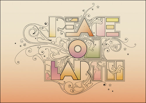
The outline around the lettering works well. Its interesting how the type is harsh but the sort elegant swirls fit in with it nicely. The 'T' and 'H' are my favorite here, i like how the illustration has overlapped into them. Quite like the colours in this two.
No comments:
Post a Comment